HOME ABOUT CONTACT
Portfolio REIT
“ Become a property investor
without the hassle “
Role
UX/UI Designer (Research, Visual Design, Interaction Design, Usability Testing)

Portfolio is a fintech platform operating under the "Property Hub" umbrella, which is connected to a Real Estate Investment Trust (REIT) – a specialised fund designed specifically for holding property in the UK. In just a few simple steps, users can invest in property through the app and gain access to all the benefits that the property market has to offer but without the hassle.

Design process

Research

App audit

Competitive Analysis

Persona

User Interview

Strategy

Product Goals

Product Roadmap

Features definition

Design

Design workflow

User flow

Wireframes

UI redesign

UI Kit

Design system

Prototype & Test

Mid-Fidelity prototypes

Usability testing

High-Fidelity prototype

1
Research Gaining insight into the product and analysing our positioning against competitors

In this phase, we get into a comprehensive understanding of our product, scrutinising its features, functionalities, and overall positioning in the market. Simultaneously, we conduct a thorough analysis of how we stack up against our competitors.

The primary question we seek to answer is whether our product offerings align with or differ from those of our competitors. This critical assessment helps us identify areas of strength, potential gaps, and opportunities for differentiation, enabling us to refine our strategy and making sure we're including the basics of the sector.

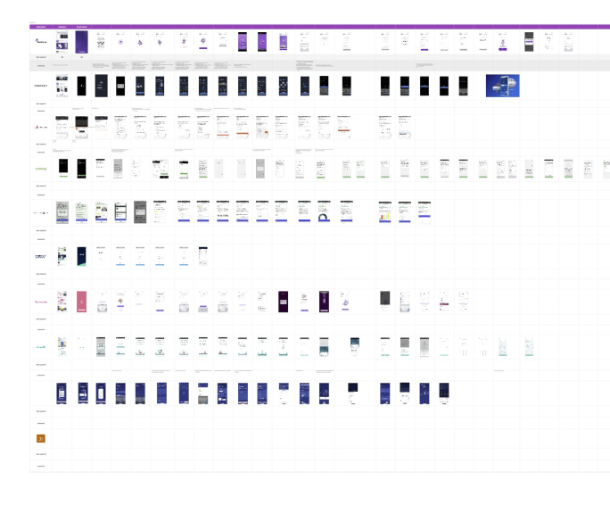
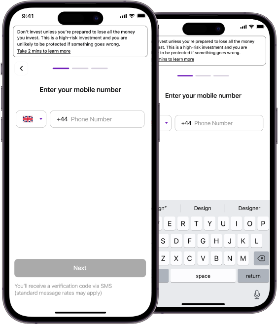
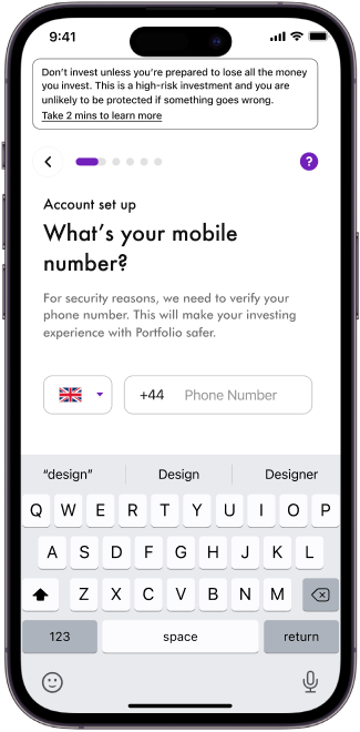
Collaborative Miro board with step by step screenshots of the different features and flows 
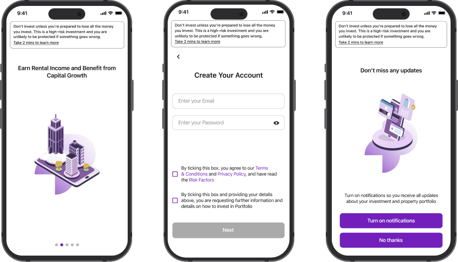
from competitors (image of the Onboarding flow)

Auditing the current App from the UX/UI point of view to detect points of improvement

First off, we took a close look at how the current app was built. We examined everything from how easy it was to navigate to how intuitive the controls were. Basically, we wanted to make sure using the app is a breeze for everyone.

At the same time we dived into the UI design. This involved scrutinising the layout, colour scheme, fonts, and overall visual appeal. We wanted the app to not only function well but also look consistent while doing it.

As part of the audit, we also compared the app to the similar ones we found in the market during the competitors analysis. This helped us identify areas where we could improve and ways we can stand out from the competition.

Once we've gathered all the data, we compiled a comprehensive report with our findings. This included recommendations for tweaks and enhancements to enhance the overall user experience, specially the onboarding one.

Findings:

  • Onboarding wasn’t optimised to give the user the best experience:
  • Lack of hierarchy on the screens (font size, copy positioning, colours...)
  • Lack of consistency in design
  • No optimisation on the number of actions (keyboard not being displayed automatically, not collapsing after filling a formatted input...)
  • No explanations or information to the users of what to expect next
  • User interface to be improved:
  • Not UI Kit in place
  • Non-personalised use of illustrations
  • Lack templates in screens
  • Not optimised for different screen sizes
Initial designs of some screens of the Onboarding flow

Getting user feedback to understand the issues they’re facing

Together with the Head of Product and Project Manager, we created a spreadhseet as a script with questions we wanted responses of to use as guidelines when doing the interviews. Our point of view on that was that we didn’t want that to become a formal interview, and more a space to share and have an open conversation. By the first 6 interviews, we detected almost 80% of the pain points the user was finding when using and investing in the app.

Findings:

The main ones to address and prioritise were the following ones:

  • More updates of what was happening behind scenes. Even if there wasn’t a major update on the REIT, the users wanted to know what we were up to and what we were working at.
  • REIT performance. Some users were tracking the REIT performance by themselves by having spreadsheets where they were taking notes of how their investment was performing.

Documenting on Figma the current App design and building and structuring a workflow within the company

One of my tasks involved documenting the current status of the app on Figma. This entailed creating various flows and building a prototype that accurately reflected the live version of the app. The purpose behind this effort was to track any releases made during the sprints. As such, this file was updated every two weeks.

As part of the design task, we structured Figma files and designed a flow with the different stakeholders for opening tickets in Jira and how to link them to different screens within Figma
The first prototype, built in Figma, displays the initial status of the app as it appeared on the App Store and Google Pla
2

Strategy
Applying all the knowledge we gathered during the Research phase to build the product Roadmap aligning it to the business strategy

In this phase, we aim for a deep understanding of our product, examining its features, functionalities, and market positioning. At the same time, we conduct a comprehensive analysis to evaluate our standing relative to competitors.

Our main focus is to determine whether our product offerings align with or diverge from those of our competitors. This critical evaluation aids in pinpointing our strengths, potential areas of improvement, and opportunities for differentiation. It allows us to refine our strategy and strengthen our competitive edge in the market.

After understanding what our competitors are offering, we organized the new features into clusters or groups. We then integrated them with our existing plans and objectives for the product. This strategic alignment enabled us to determine which features should be implemented first, ensuring that our product development efforts are focused on areas that will provide the greatest value to our users and competitive advantage in the market.
3

Design:
Establishing visual design and fixing the usability issues detected during the research phase

One of the most glaring issues I noticed when I joined the team was the lack of design consistency throughout the app. From paddings to margins to font sizes, the app was not built according to UX/UI standards. To address this inconsistency and ensure a more cohesive user experience, we implemented a Design System. This system was established to provide a sense of reliability and trustworthiness in the app for users.

Example of the initial status of an Onboarding screen

Solution:

An example of how we improved interface and usability is evident in the Onboarding screen, specifically when prompting the user to enter their phone number. In this instance, we made several enhancements:

  • We created a template for all the Onboarding flow screens, giving hierarchy to the information inside, respecting margins, fixing the font sizes, while also maintaining consistency with the previous design to minimise developers' work hours.
  • We minimised user actions by automatically displaying the keyboard once the user accesses the screen. This not only streamlines the process but also establishes a clear visual hierarchy, making it easier for users to identify where to input their information.
  • We provided an explanation of why we require this information, thereby increasing transparency and potentially boosting conversion rates.
  • Additionally, we offered assistance to users to further facilitate the process.

Displaying all the data the users were requesting from the interviews

One of the biggest findings during the interview process was the request from the user side of the performance of the REIT. We listened to them and created a new dashboard were they could find the following data retrieved from the back end:

API were created in order to retrieve some of the data from back end.

Inital status of the dashboard
Final design of the dashbaord including all the data and performance the user was asking for
Would you like to get more detail about this project?
GET IN TOUCH!