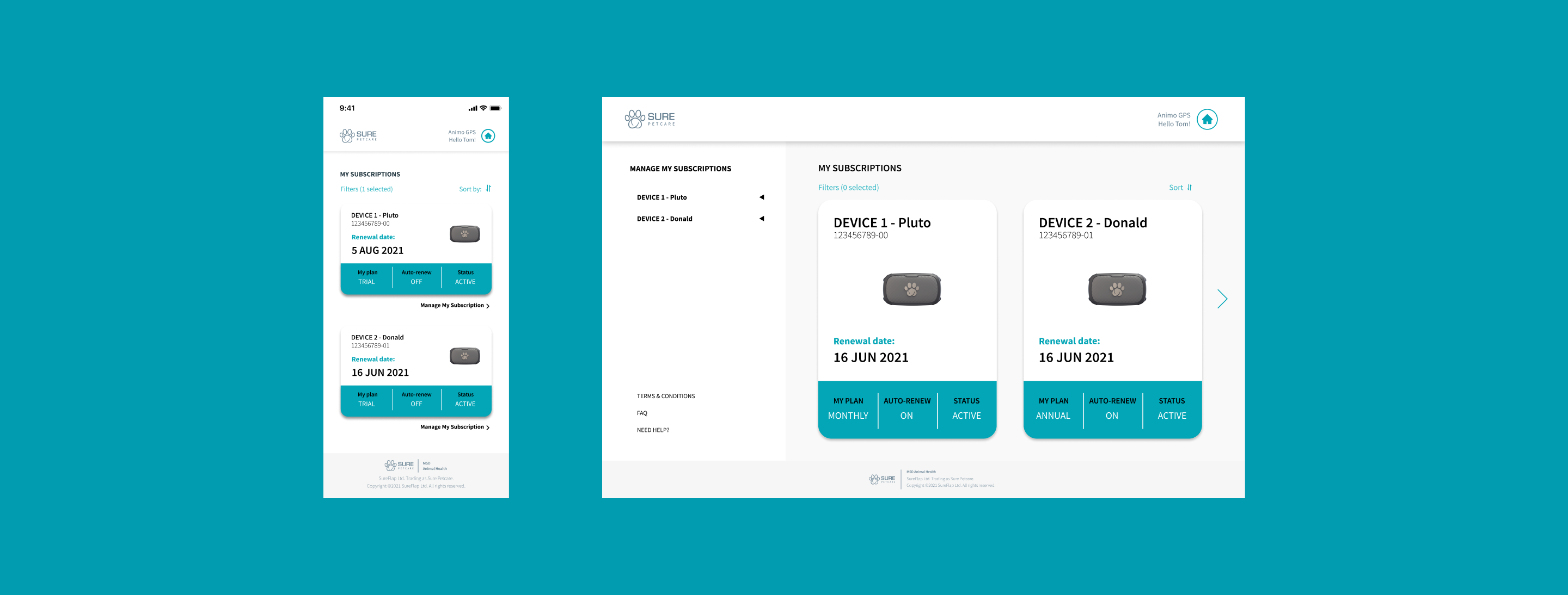
- Client’s requirement gathering
- Research, User cases and Wireframing
- UI Design Toolkit
- Fully working mobile platform
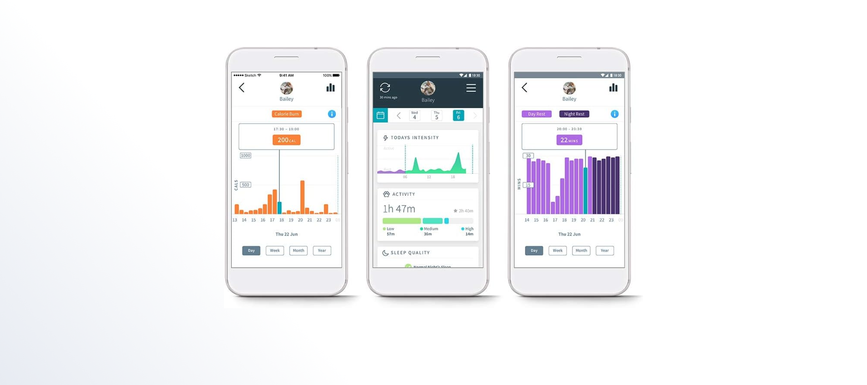
Building a responsive web payment platform to manage subscriptions of the Animo App
integrated with the Zuora platform
Animo wanted to move their payment platform from Salesforce to Zuora. We integrated the features of the new platform and built the new UX
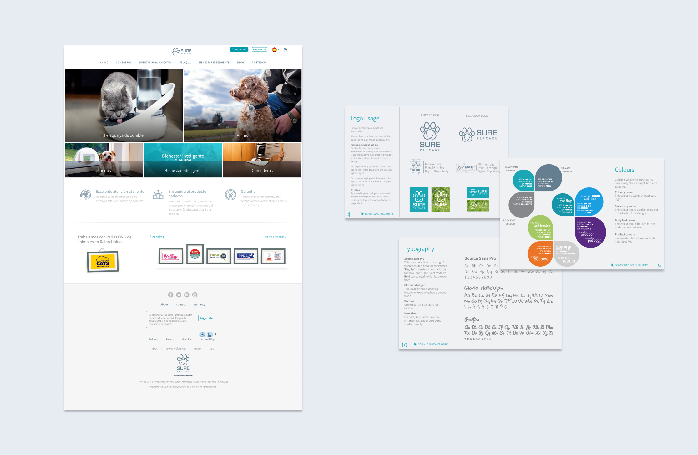
The first step at every design project is to gather all the information the client currently has and to understand the brief. This includes Research up to date, Product Strategy and Brand Guidelines.
Part of that understanding and which the designer should be aware of are the third parties and APIs the App or Web is using. This gives you a good overview of which actions, features and data can we send and retrieve on the interface.
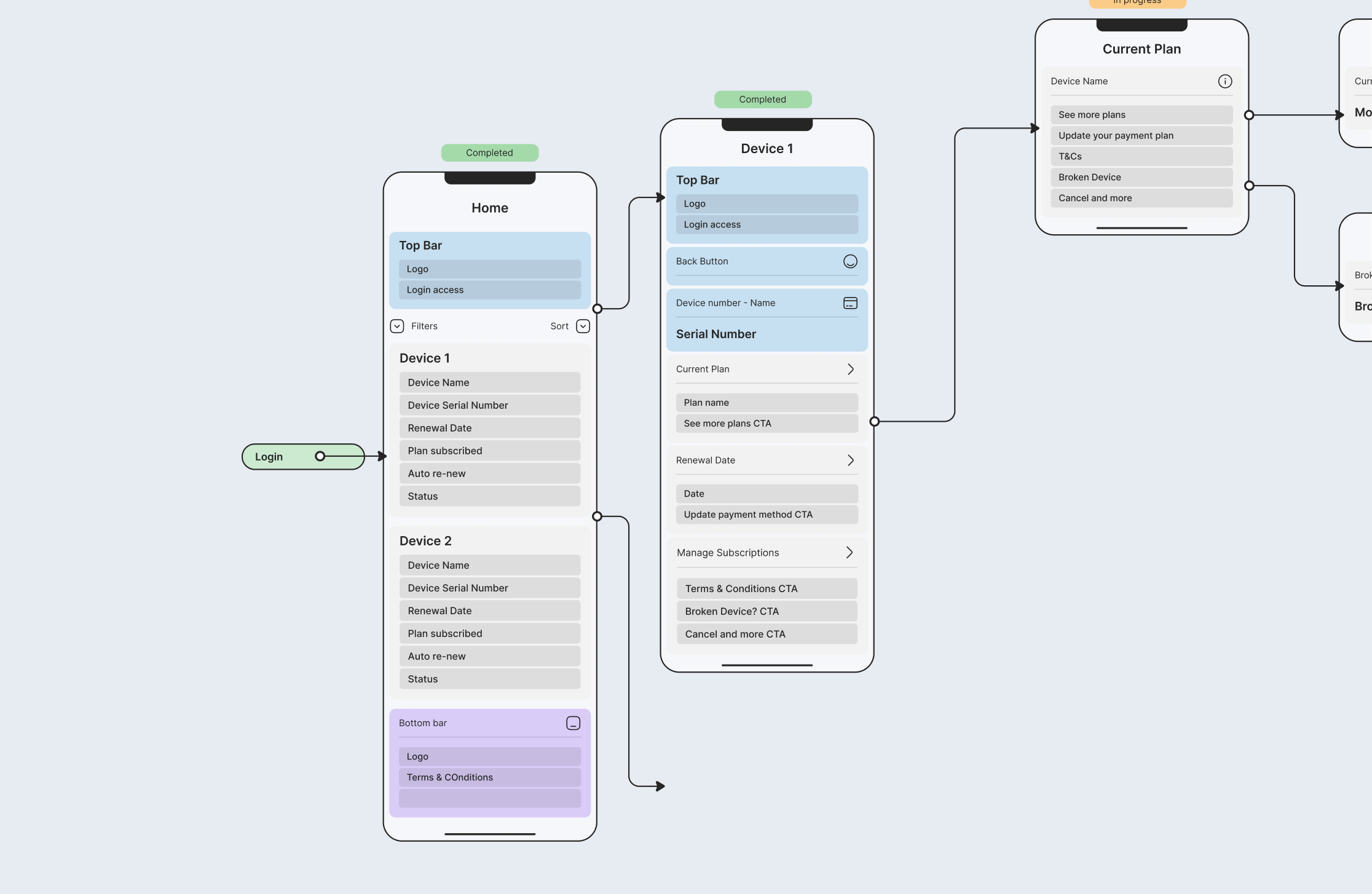
We created user flows to start clustering the features and information to display on every screen at each step
First, we used information architecture to help us build the user stories that were needed to be accomplished by the user. Once we had all the actions listed, we moved into building the user flows where we brokedown step by step what was needed to carry out the actions previously listed.
This stage in the app or web development alignseveryone to hit the brief goal and lock the design job that needs to be carried out before starting applying the design.
Taking the research outputs, we started creating wireframes and applying the design following the brand guidelines
We wanted a seamless design integraton with the Animo App. The reason behind it was that most of the users would be funneled from it when they selected to upgrade their plan to track their pets. This way we ensured the users felt the transition between web and app more familiar
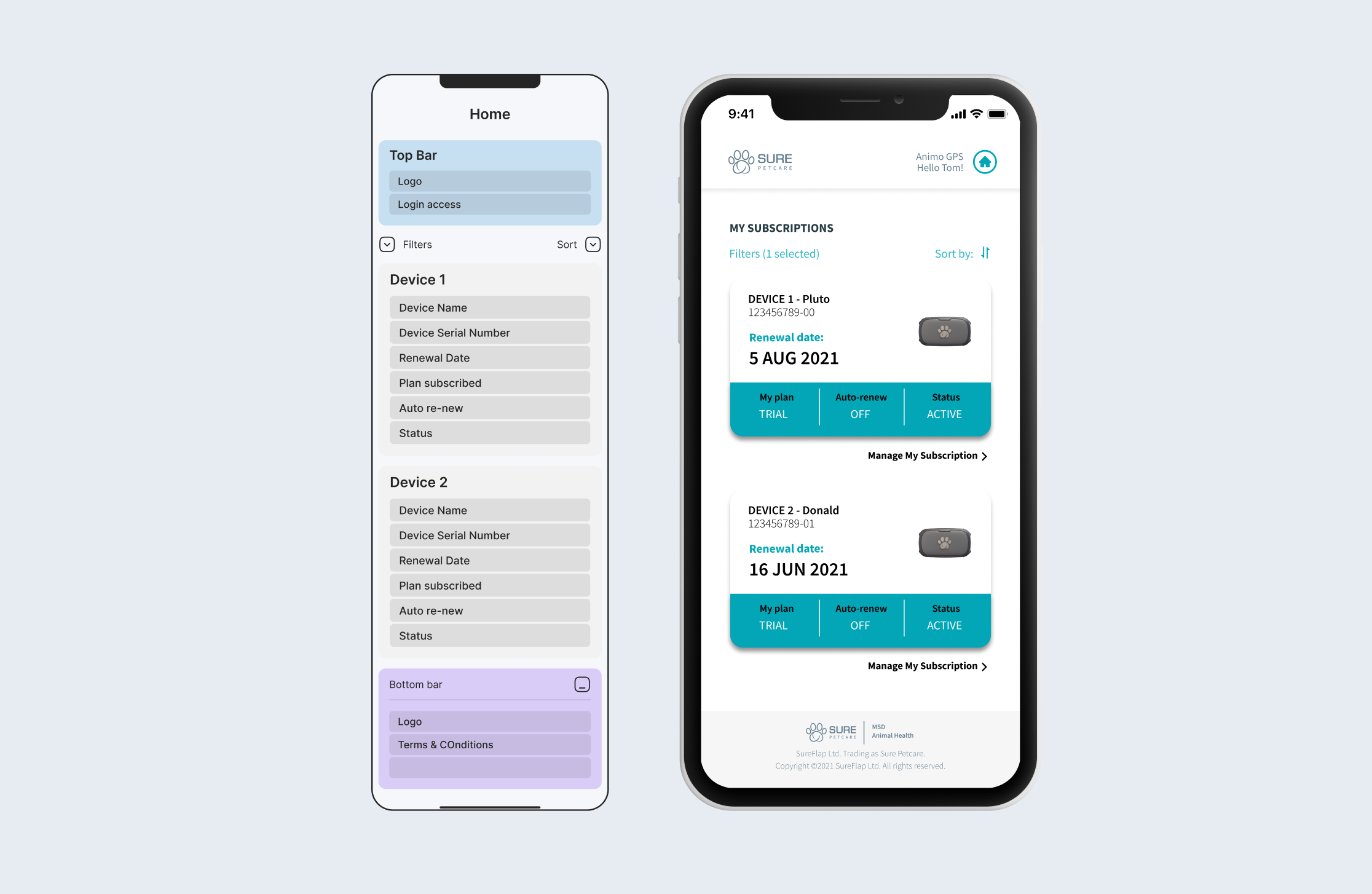
With every new milestone - which was composed by a pack of features - we tested the design and flows to make sure we were following the right path
We tested every flow and feature by building a Figma prototype before doing the handoff to the developers. These were used to test with real users to check the overall Look & Feel, user pain points and web app performance. Three iterations were needed in total before handing off the design. Below is the second iteration used with real users.
