HOME ABOUT CONTACT

End-to-end development of the

first loan app in the Saudi Arabian market

My Role: Sr Product Designer
  • Competitors analysis / Personas
  • Design direction
  • Customer journey mapping
  • Low to High fidelity wireframes
  • Prototype and user testing
  • Design system build and maintenance
Outcomes:
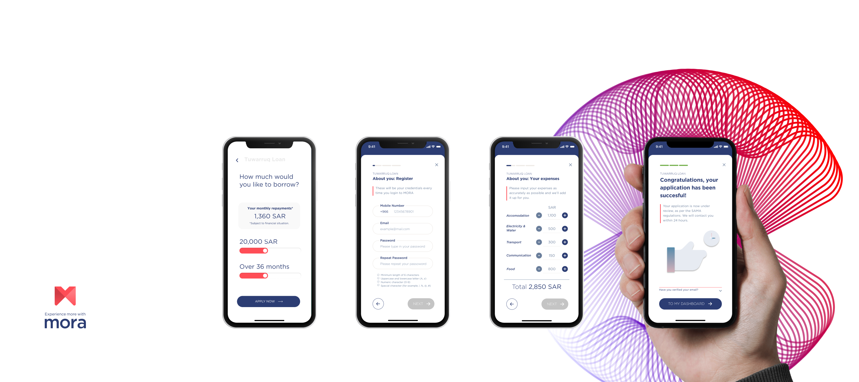
  • Available app on the Apple Store and Google Play
  • Fully responsive website design
  • +1K new users in the first month

Research

Conducting a comprehensive competitors analysis in conjunction with thorough market research

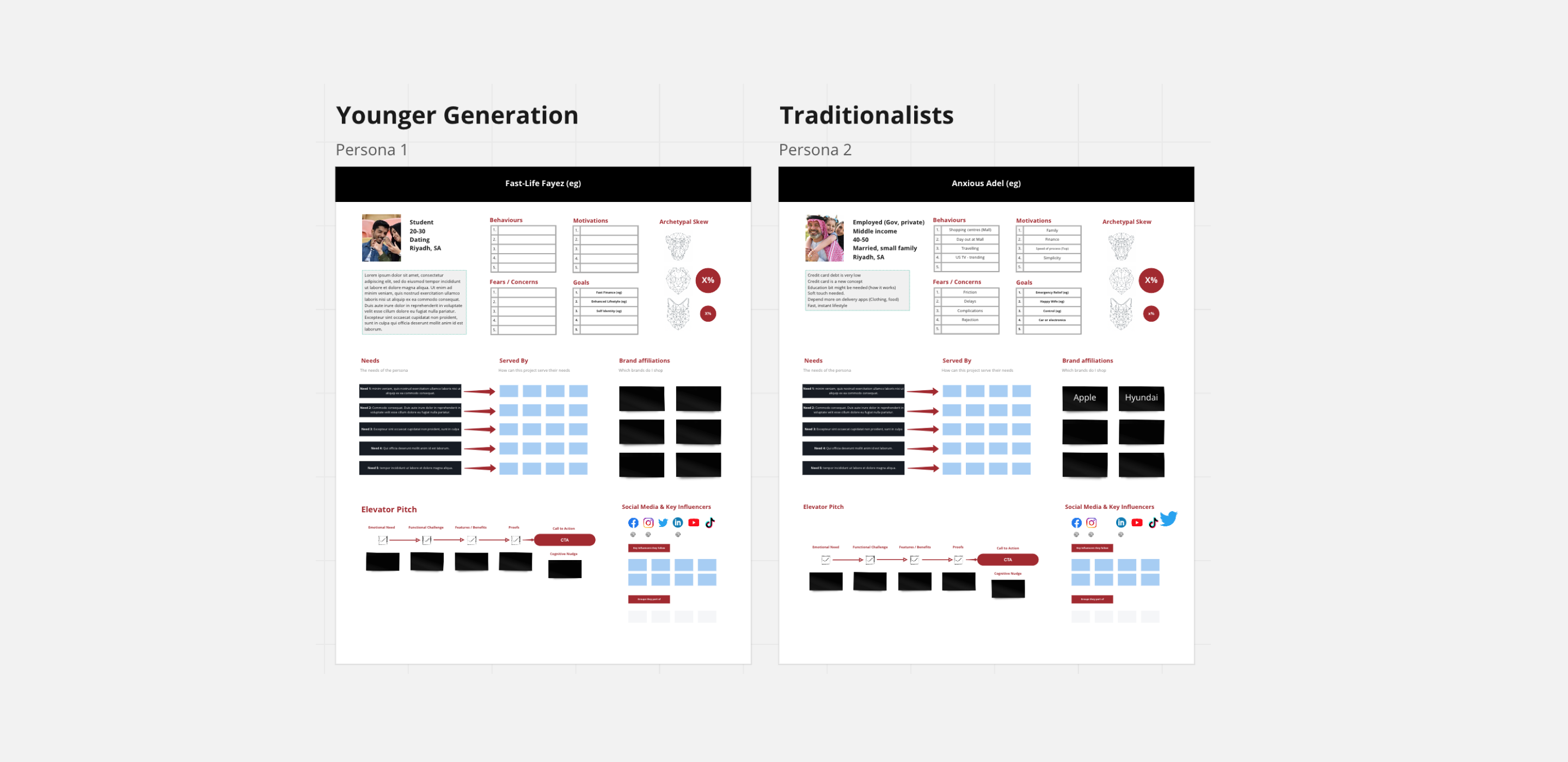
Our initial steps involved gathering and organising all project documentation, followed by scheduling workshops with the MORA board team. Throughout these sessions, our focus was on understanding and aligning the strategy from both the brand and user perspectives. This was particularly crucial given the team's limited experience in the Saudi Arabian market. Using personas, we were able to humanise the future user experience, providing a tangible representation of their behaviors and needs. This not only facilitated a deeper understanding for our client but also guided us in pinpointing the needs and objectives of their target audience more effectively.
Wireframing

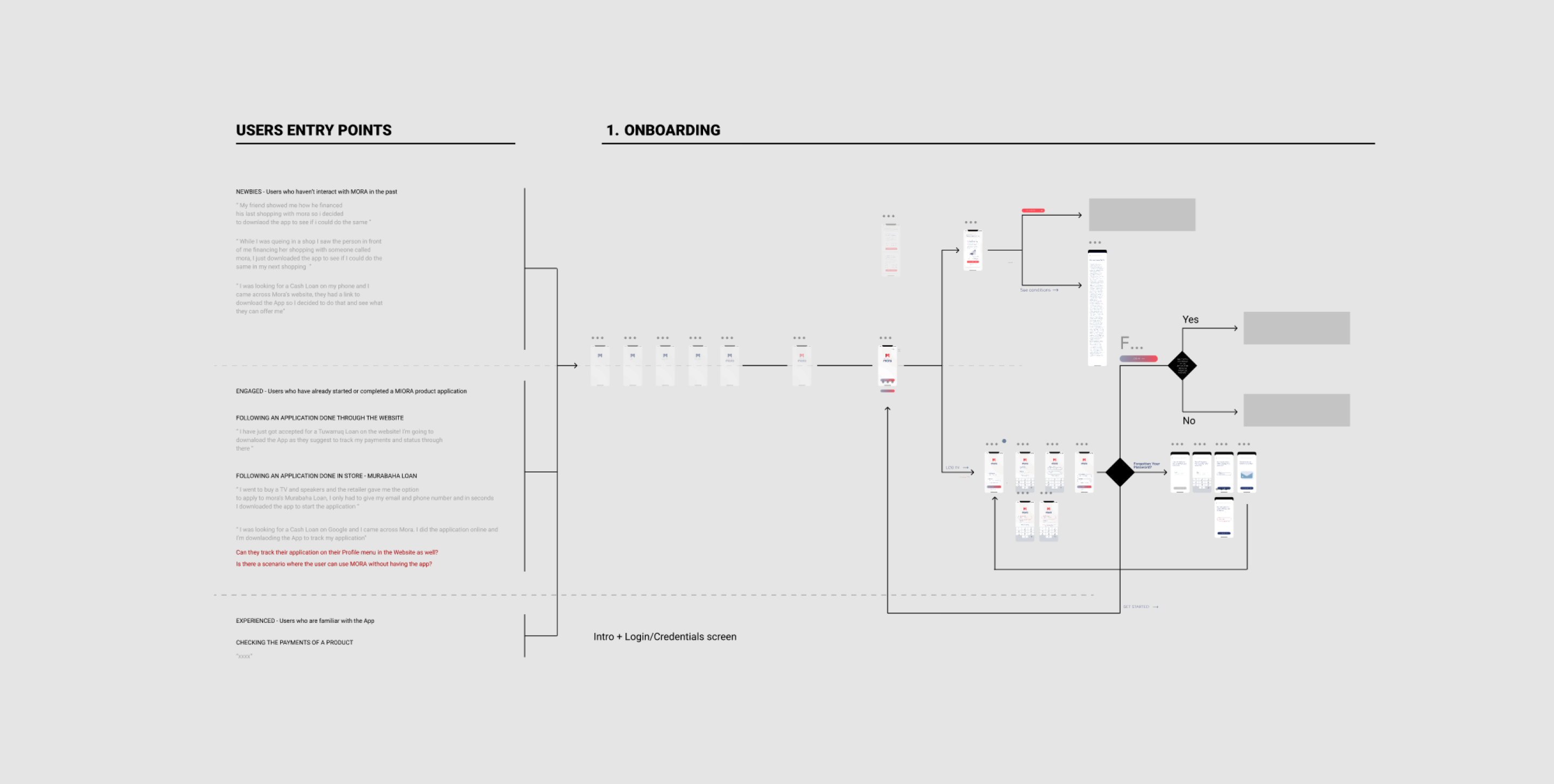
Customer journeys were created to start building the different flows that will form the MVP

Based on our research we created detailed customer journeys, outlining the experience for the different types of users including, new customers and customers. From this we identified design opportunities and defined the features for each customer type. We also created the information architecture, that laid out the detailed blueprint for how we would organise the portal and every detail of information.

Design system

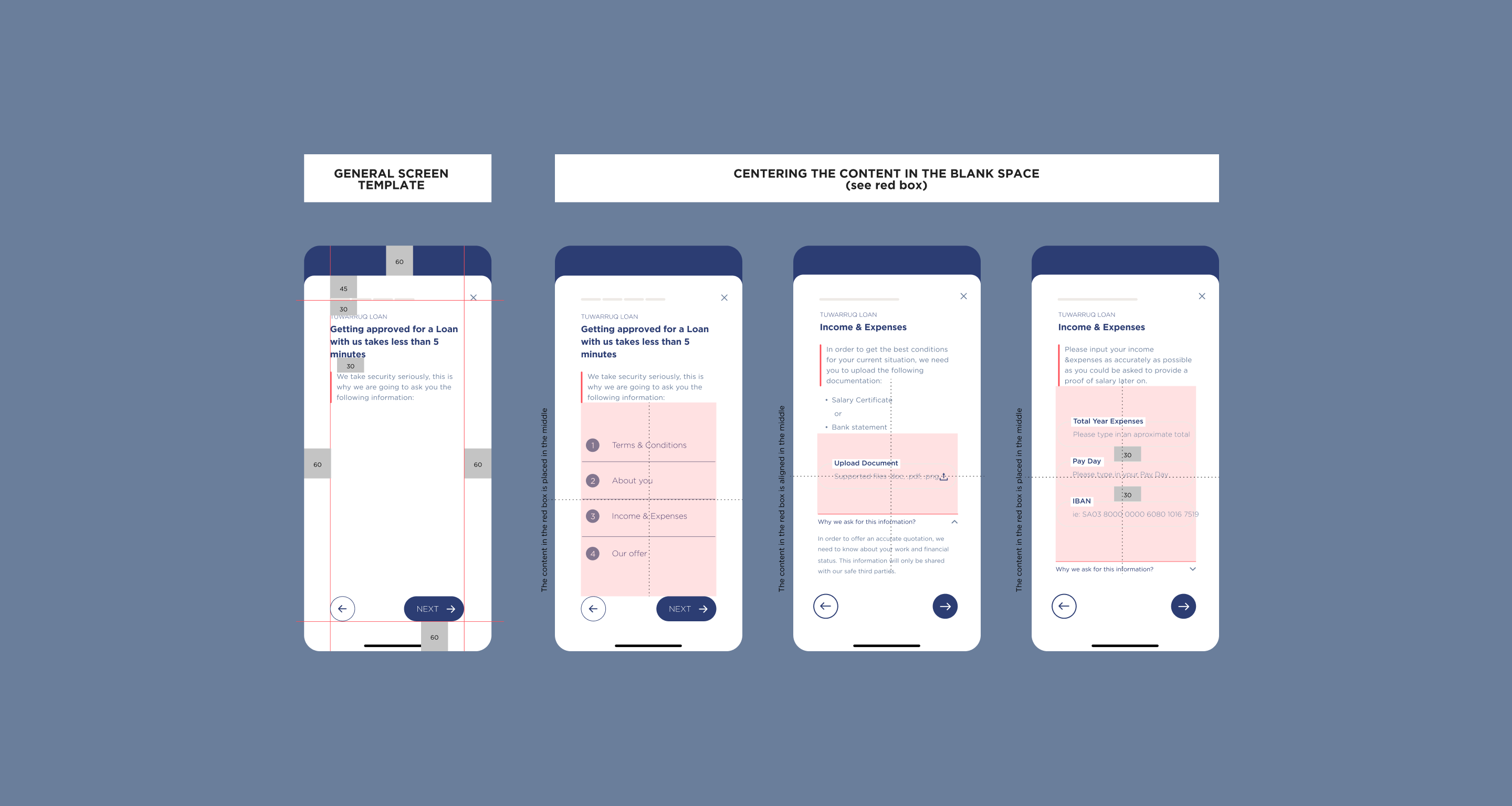
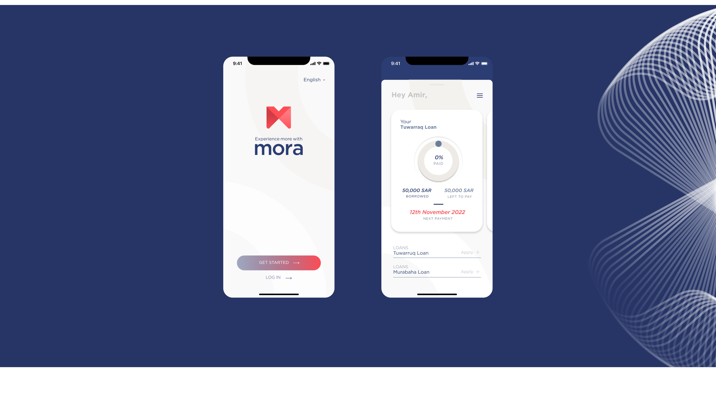
Being the pioneer in Saudi Arabia's digital loans market, recognizing the significance of user familiarity and trust in financial interactions, we adopted a classic banking approach to the user experience of the app

As crucial as it is to provide brands with a distinctive and ownable user experience, it's equally essential for users to feel comfortable with the interface. In light of this, we chose to begin with a classic banking interface to ease the learning curve for users. By adopting a familiar layout, we aim to facilitate smoother interactions and ensure a seamless transition for users, ultimately enhancing their overall experience.

Web design

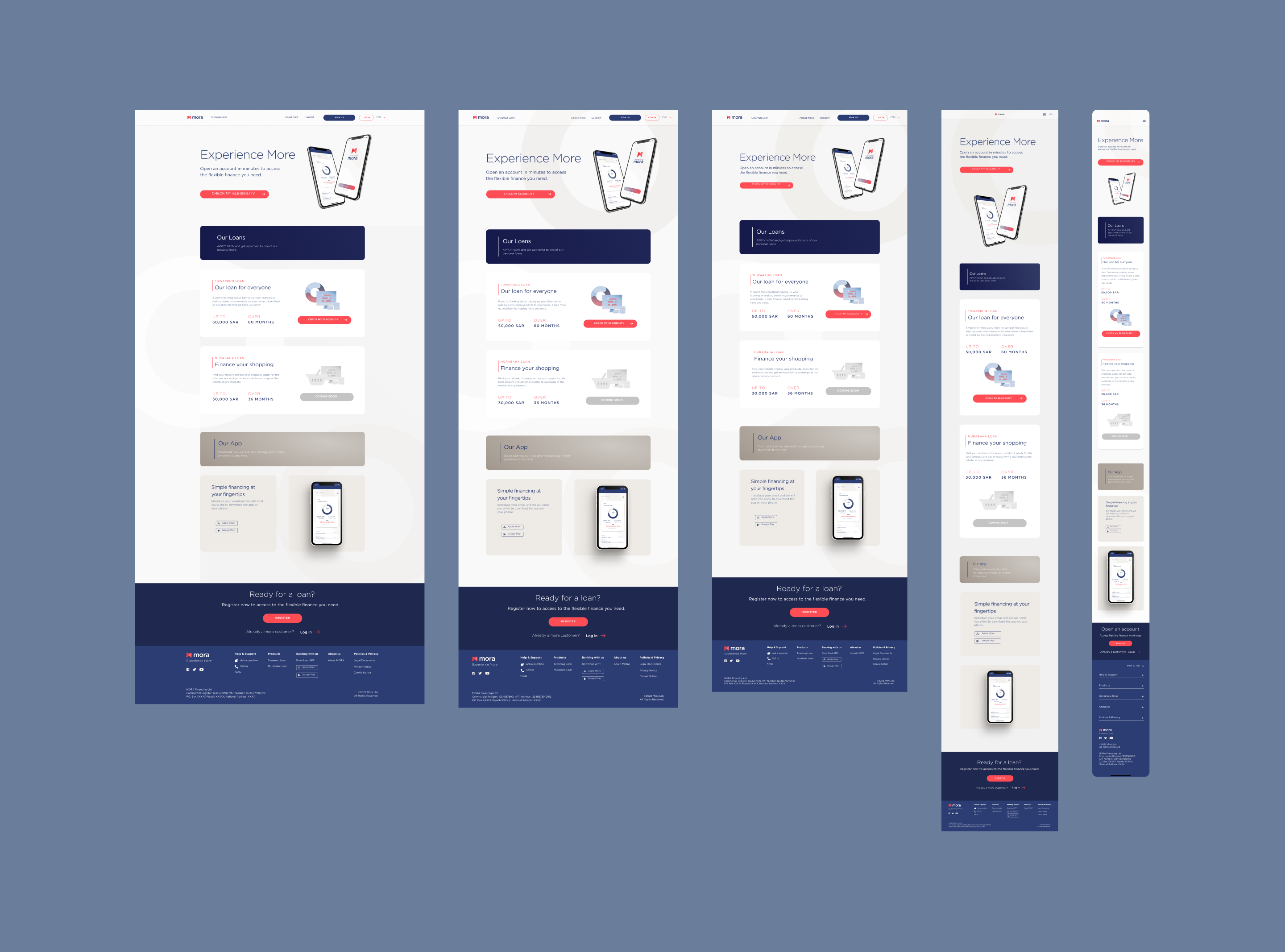
Designing for web responsiveness across various device sizes to prevent any misinterpretations

To achieve design consistency and responsiveness, we defined breakpoints and utilised frameworks like Bootstrap. By strategically implementing breakpoints—those specific points at which the layout of the website responds and adapts to different screen sizes—we ensured that the design remained visually appealing and functional across a variety of devices.